Have you ever wondered just how closely Bitcoin ETFs track gold prices? Or how the stocks of tech heavyweights like Apple and Microsoft move in tandem with energy giants like ExxonMobil? A correlation heatmap can uncover these connections in a flash, guiding you on whether to spread out your portfolio or hedge against risks. This method applies to all kinds of assets, from cryptocurrencies like Bitcoin ETFs to commodities like gold or forex pairs.
A heatmap is essentially a colorful grid that turns a data matrix into something visual - each square stands for a correlation coefficient (ranging from -1 to 1), with cool blues for negative values and warm reds for positive ones. It's a straightforward yet potent way to spot patterns in massive datasets at a glance.
Picture it like a weather map: blue signals "cold" (assets moving in opposite directions, like one rising while the other drops), and red means "hot" (they're in sync, rising or falling together). It's similar to that kids' game of "hot or cold" - "hot" means the stocks are buddies, sticking close, while "cold" means they're going their separate ways.
By the time you finish this article, you'll be ready to put heatmaps to work in your own projects - from basic data analysis to building interactive dashboards for real-time portfolio tracking.
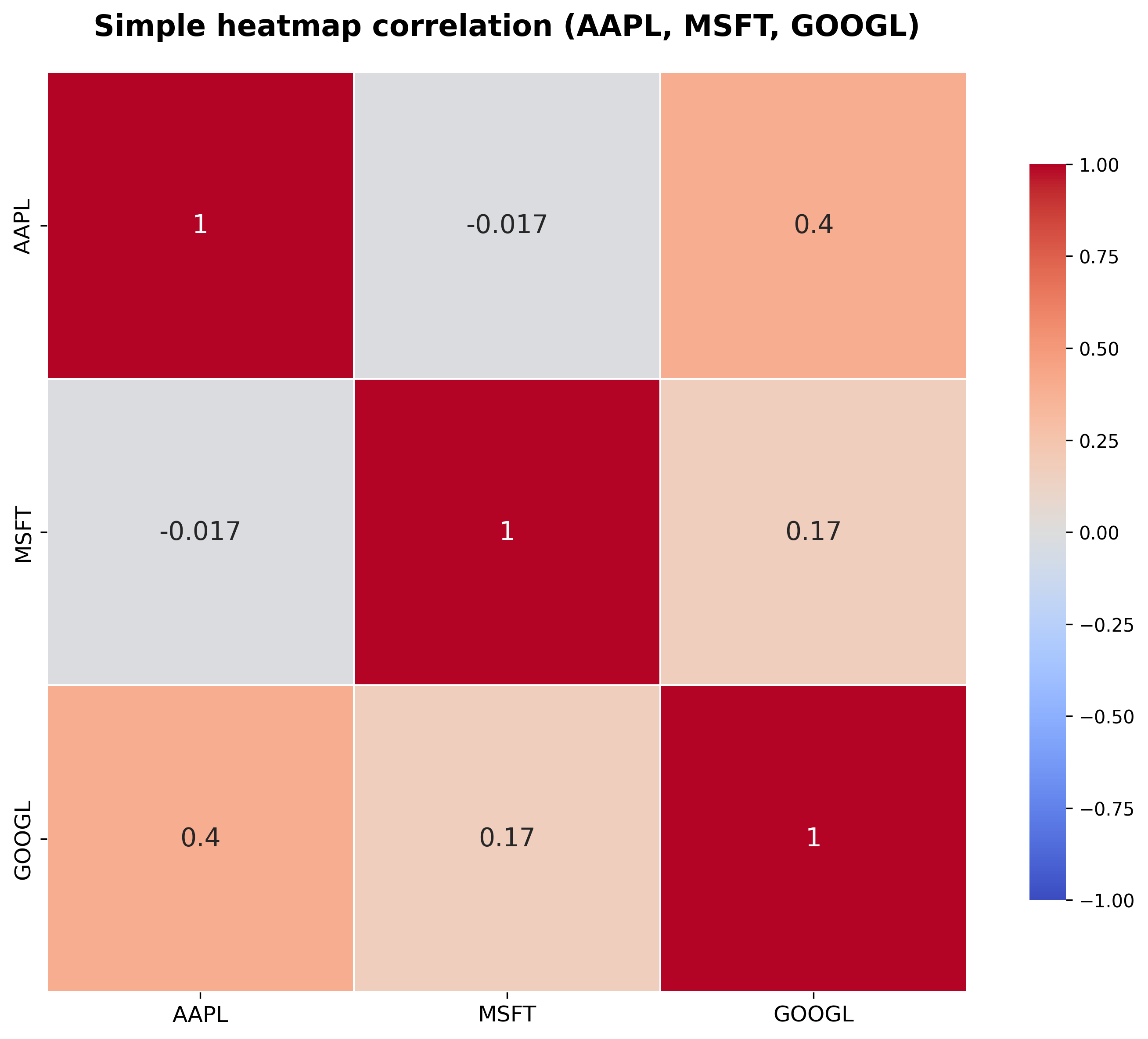
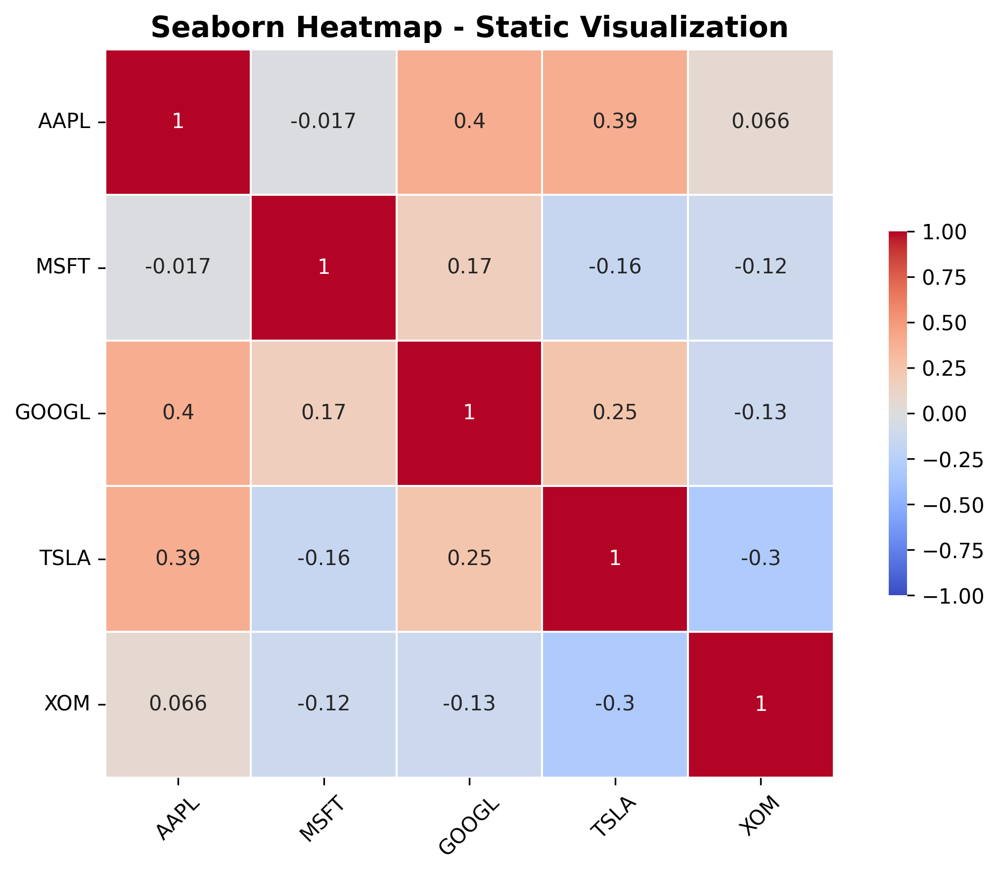
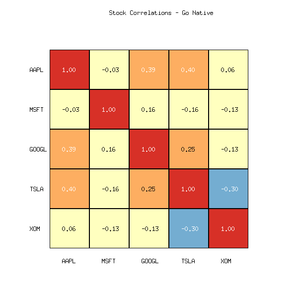
This simple heat map shows the correlations between Apple (AAPL), Microsoft (MSFT) and Alphabet (GOOGL) stocks. The diagonal red squares with 1.0 are each stock's correlation to itself (always fully synchronized). Focus on off-diagonal relationships between different stocks: these indicate how strongly the stocks move together or in opposition, with numbers for accuracy.
What are heat maps in the context of finance?
In the world of finance, a heatmap brings asset relationships to life by illustrating how their returns correlate - 1 means they're perfectly in sync, -1 indicates they're total opposites, and 0 shows no connection at all. This makes it easier to monitor daily performance, spot groups of similar assets, or even feed data into machine learning models for forecasting.
For instance, if AAPL and MSFT show a correlation above 0.8, they tend to rise or fall in unison - that's a red flag for putting them both in the same portfolio. On the flip side, a negative correlation (under -0.5) opens up hedging possibilities, like offsetting tech stocks with energy plays such as ExxonMobil (XOM). And with the Twelve Data API, you can pull in the latest data to keep your heatmaps current.
In machine learning, heatmaps are great for feature selection - they let you visualize correlations between variables, helping you pick the most relevant ones to prevent overfitting and boost model accuracy in things like pricing predictions.
Why are heatmaps effective for analyzing correlations?
Heatmaps stand out among other visualizations when you need to work with data matrices like correlations. They use color to instantly show recognizable patterns, which is especially valuable for large datasets where tables or graphs can be confusing.
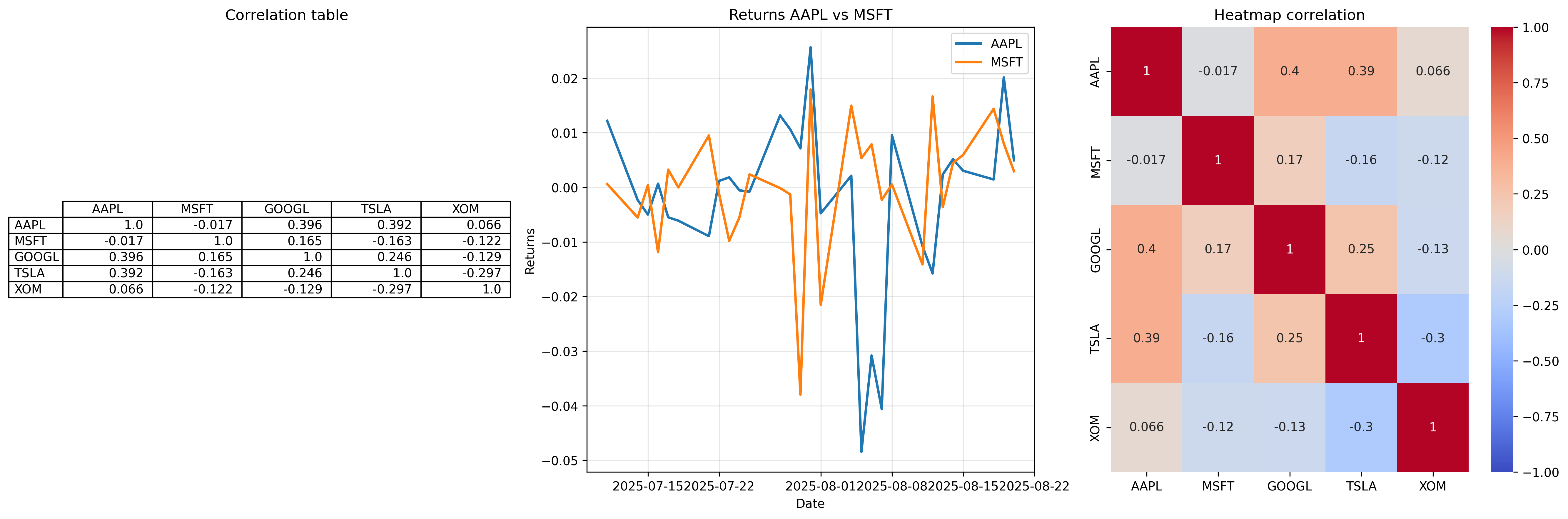
Take this example: imagine a correlation matrix for five stocks. In a table, these are just numbers, and you'd have to scan each cell to find, say, a cluster of tech stocks with a correlation >0.7. Line graphs show only pairs, but a heatmap gives an overview - one look reveals how highly AAPL and GOOGL correlate, and how their correlation with XOM is low or negative, opening hedging ideas.
Here are a few real-world use cases for correlation heatmaps, spanning different assets, time frames, and data spans:
- For building a diversified long-term portfolio, dive into monthly data over five years for cryptos and commodities. Take Bitcoin ETFs (like IBIT or GBTC) and gold (GLD) - they show a mild correlation around 0.3, so gold acts as a solid stabilizer against Bitcoin's wild swings, especially since gold has outpaced Bitcoin's returns this year (
29%versus4%). - For short-term forex trading and risk management, use daily intervals over the past year; pairs like EUR/USD and GBP/USD show a strong positive correlation above 0.8, meaning they tend to move together, while EUR/USD and USD/CHF display a negative correlation near -0.95, offering hedging opportunities against dollar strength.
- In sector-specific stock analysis for hedging during market volatility, examine weekly intervals over 3 years: tech stocks such as AAPL and MSFT often correlate highly at
>0.8due to shared market trends, but tech (AAPL) and energy (XOM) maintain a low correlation of approximately 0.22, allowing investors to balance exposure as energy stocks provide stability amid tech's higher risk in 2025.
These scenarios highlight how tailoring intervals and periods to your objectives - such as smoothing noise in monthly data for strategic planning or capturing daily dynamics for tactical trades - can yield actionable insights.
In finance, heatmaps speed up sector analysis - tech often moves together (>0.7), energy can go sideways (<0) - and during crises like COVID-19, rising correlations signal risks quickly.
Step-by-step guide to analyzing correlations with heatmaps
Obtain U.S. stock data
We use the following stocks to get the data: AAPL (Apple Inc.), MSFT (Microsoft Corp.), GOOGL (Alphabet Inc.), TSLA (Tesla Inc.), XOM (Exxon Mobil Corp.) via Twelve Data API. Calculate returns (pct_change) and Pearson correlations.
Choose intervals based on your goals: Daily (1d) for short-term volatility analysis, weekly (1w) for medium-term trends, or monthly (1m) for long-term stability. Periods should cover at least 1-5 years for robust results. Note that correlations typically increase from daily to monthly intervals as noise is smoothed out. For efficient markets like U.S. stocks, daily intervals are particularly reliable for capturing short-term dynamics without excessive aggregation, while monthly ones provide smoother, more stable insights into long-term patterns.
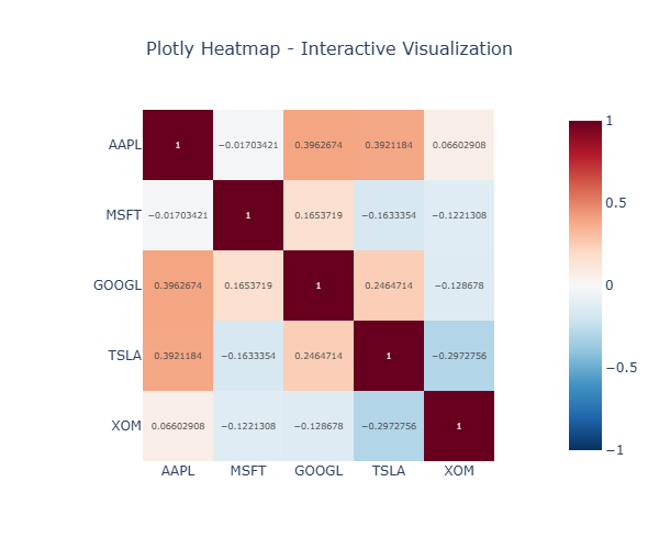
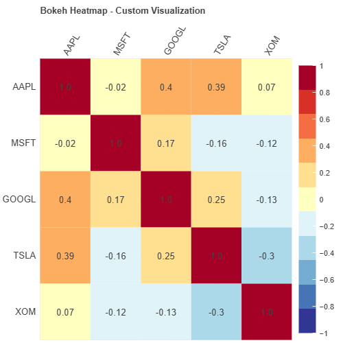
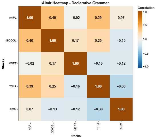
Visualization in Python (Seaborn and alternatives: Plotly, Bokeh, Altair)
Start with Seaborn for basic:
Plotly for interactivity:
Bokeh for customization:
Altair for declarative:
Test the code with your own Twelve Data API key, using this pad in Google Colab. Replace "YOUR_API_KEY" with your API key from twelvedata.com. No installation is required as Colab runs in the cloud and all dependencies are installed automatically.
Visualization in other languages
For R, Julia, Go, and PHP, we provide key visualization snippets (assuming a ready-made corr_matrix). The full code with data retrieval is available in GitHub Gists for convenience.
R (ggplot2 and ComplexHeatmap):
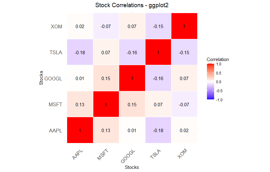
ggplot2 for simplicity:

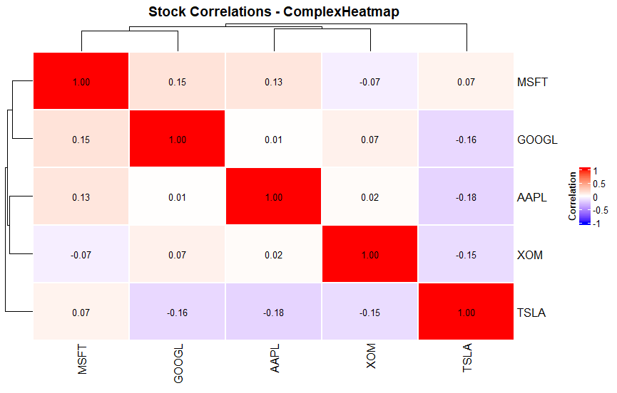
ComplexHeatmap for advanced with clustering:
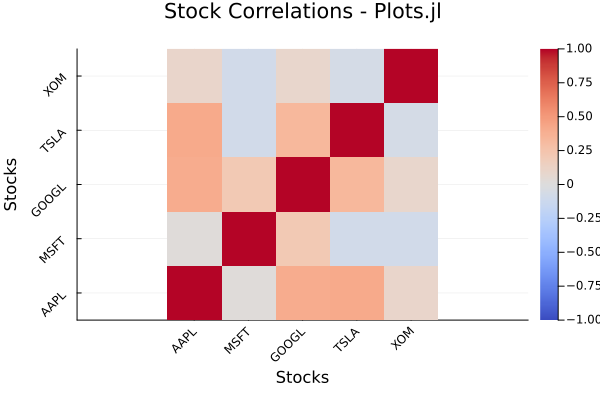
Julia (Plots.jl and CairoMakie):
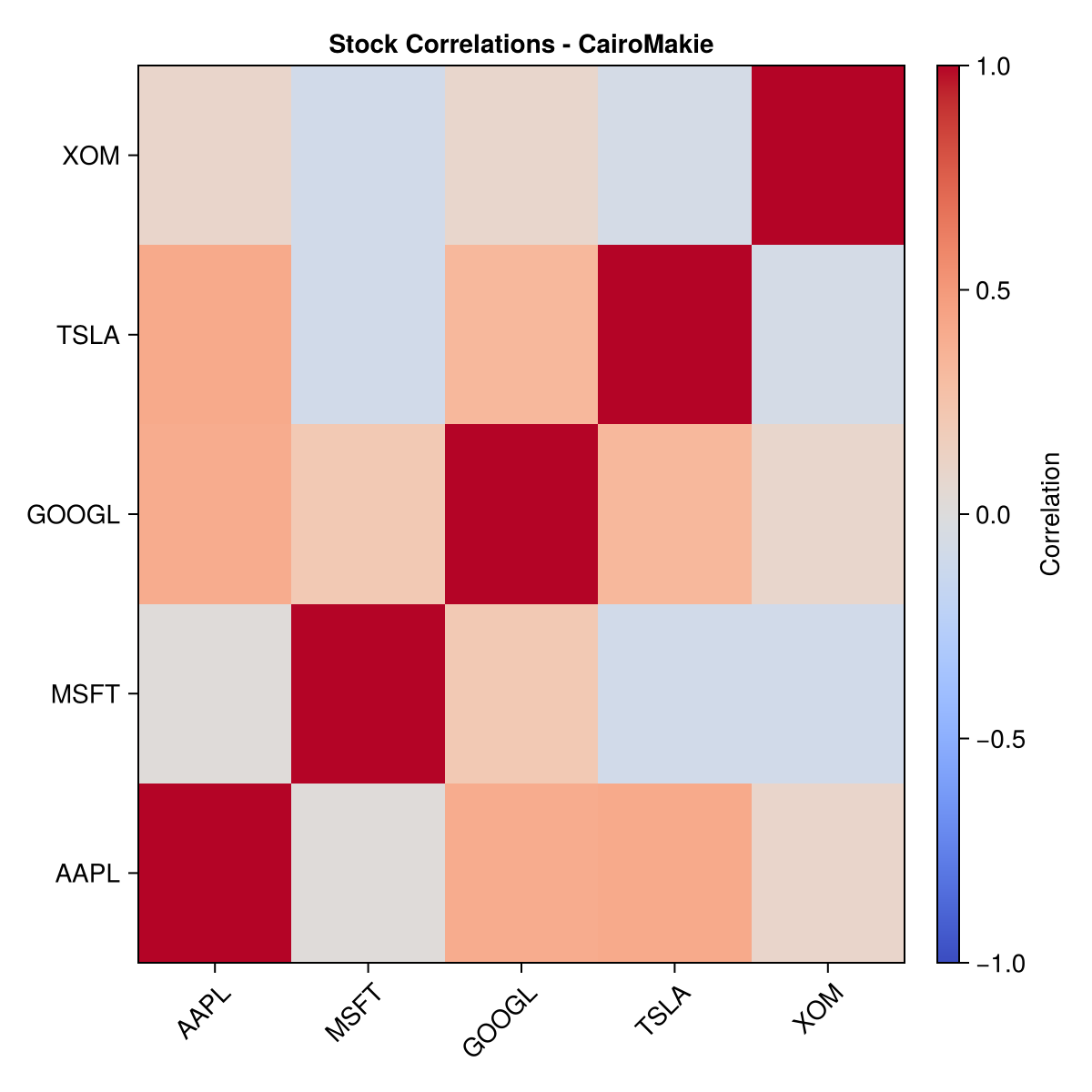
CairoMakie:
Go (go-echarts and gonum/plot):
gonum/plot:
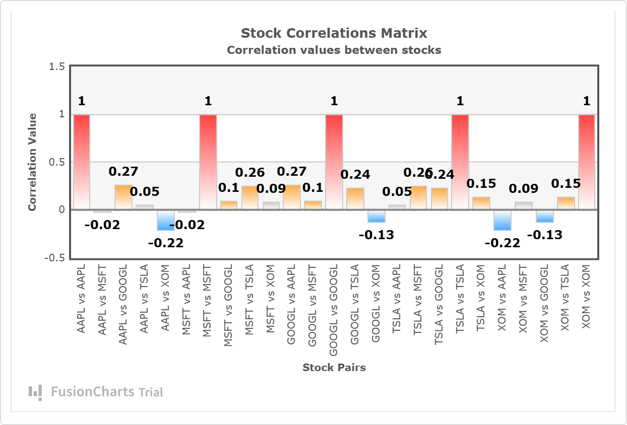
PHP (Heatmap.js and FusionCharts):
FusionCharts:
Advanced customization and interpretation
Add clustering for grouping - this is useful to automatically identify clusters of similar stocks (e.g. all tech together), for sector analysis (Seaborn: sns.clustermap(corr_matrix, cmap='coolwarm'); similar in others).
Masking - by hiding the top triangle (symmetrical part) and avoiding duplicates this makes the map cleaner by focusing on unique information, especially in large matrices: in Python np.triu(corr_matrix, k=1) for masking, similar in R/Julia.
Export - needed for integration into reports, presentations or web applications where static images are more convenient than interactive ones: plt.savefig in Python, ggsave in R, savefig in Julia, p.Save in Go.
Interpretation (not tips): High correlation (>0.8) - risk of concentration in portfolio, as in tech (AAPL/GOOGL), where stocks react to general trends; negative (< -0.5) - chance of hedging, balancing tech vs. energy. Beyond price returns, apply heatmaps to daily profits/losses in trading portfolios to identify dependencies in gains and losses, further aiding risk reduction. In crises, correlations rise, signaling the need for rebalancing. In ML - for feature engineering (feature modifications for better models).
Conclusion
Heatmaps simplify spotting stock correlations, making diversification and risk management a breeze. Whether you're using Seaborn or ggplot2 for basics, or Plotly and ComplexHeatmap for advanced stuff, pick what fits your needs and integrate APIs to stay current.
To get hands-on, start tinkering with a small portfolio - and hey, share your findings on social media!
GitHub Repository Links
Author: Artemis